Jason Fried explaining why obvious things need to be kept obvious even when the hard things become possible.
Much of the tension in product development and interface design comes from trying to balance the obvious, the easy, and the possible. Figuring out which things go in which bucket is critical to fully understanding how to make something useful.
Shouldn’t everything be obvious? Unless you’re making a product that just does one thing – like a paperclip, for example – everything won’t be obvious. You have to make tough calls about what needs to be obvious, what should be easy, and what should be possible. The more things something (a product, a feature, a screen, etc) does, the more calls you have to make.
This isn’t the same as prioritizing things. High, medium, low priority doesn’t tell you enough about the problem. “What needs to be obvious?” is a better question to ask than “What’s high priority?” Further, priority doesn’t tell you anything about cost. And the first thing to internalize is that everything has a cost.
I will be thinking about this every time I will be driving my car. I own Skoda Kylaq and my variant has automatic climate control. It seems that when automatic climate control became possible in cars, car makers thought users will not use the A/C controls anymore and put in fancy-looking-but-will-get-activated-or-deactivated-on-slightest-of-accidental-touch based controls.
Having touch based controls already makes it difficult to use while driving, but here the layout of the touch panel is so bad at times I take 1-3 seconds to figure out if the action worked or not.
Here’s how my touch based A/C controls look like (Figure 1). At first glance it everything seems to be present. But the moment you start using it, you realise how badly it is designed.

Let me annotate and show how to use the touch based panel (Figure 2).
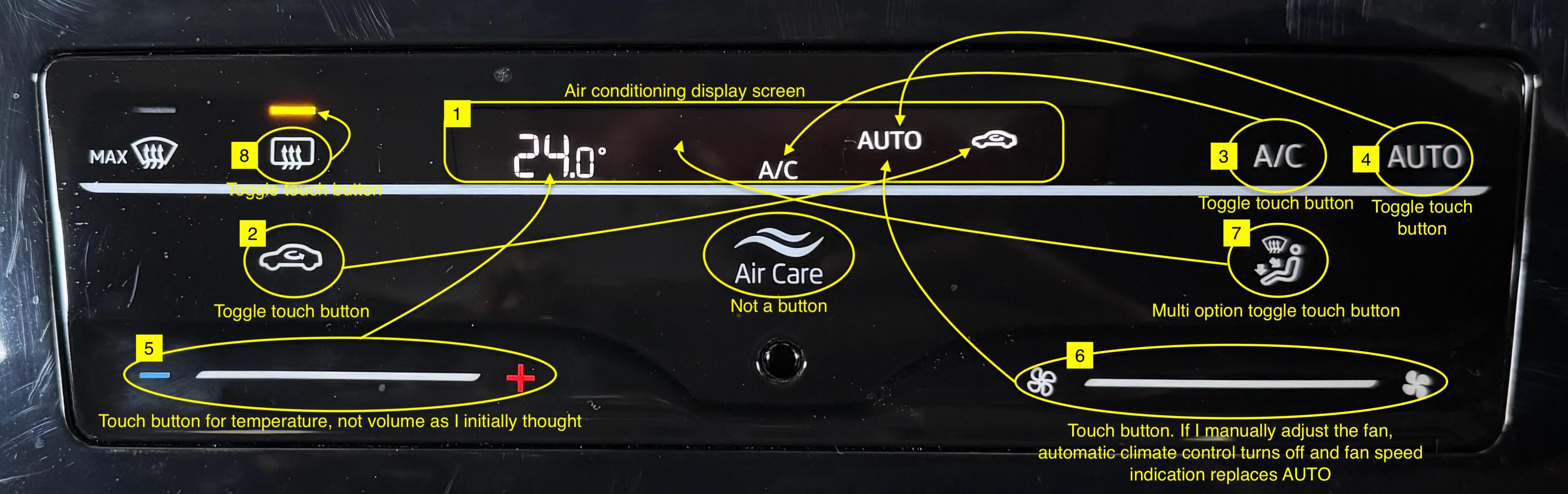
There’s a small display screen (#1) in the top-center which displays key information.
The buttons of recirculate internal/external air (#2), on/off A/C (#3) and automatic climate control (#4) are all toggle touch buttons. But touching them, doesn’t light them up. Instead that information shows up on the display screen.
Similarly, the touch bar for temperature up/down (#5) and fan speed (#6) doesn’t use the line to give out information. That also goes in the display screen.
But the touch button to set the direction of the air outlet (#7) is a multi option button with 4 options. Each touch enables the next option but I haven’t memorised all the options and their order. So cycle through them twice to find my option but the first time I am just getting the order. In the analog days a knob was used here and I understand its usability—and importance—now.
But the toggle touch button to switch rear window heater on/off (#8) has a small LED light to indicate its on/off status. Something that should have been implemented for all the other buttons.
All this has led me to set the temperature, confirm if automatic A/C is enabled and then start my drive. If this is what Skoda wanted from its users, then the obvious option here should have been to have a physical on/off button for automatic A/C control and a physical knob for setting temperature.

You must be logged in to post a comment.