Category: Technology

  • Create List in SharePoint Online based on another list

    This has stumped me every now and then, so noting this down to help me remember it in time of need.

    SharePoint Online provides a way to create a List based on another list. But this option is only available when you go to “Site Contents” or /_layouts/15/viewlsts.aspx page and click on “New > List”. It also shows up option to create List based on Excel.

  • Get MUTF_IN codes for mutual fund to use in GOOGLEFINANCE function in Google Sheets

    Update 30-Jul-2023

    I am not sure if this was already there, but when I wrote this blog I couldn’t find this option. The below post becomes excessive in light of this new information.

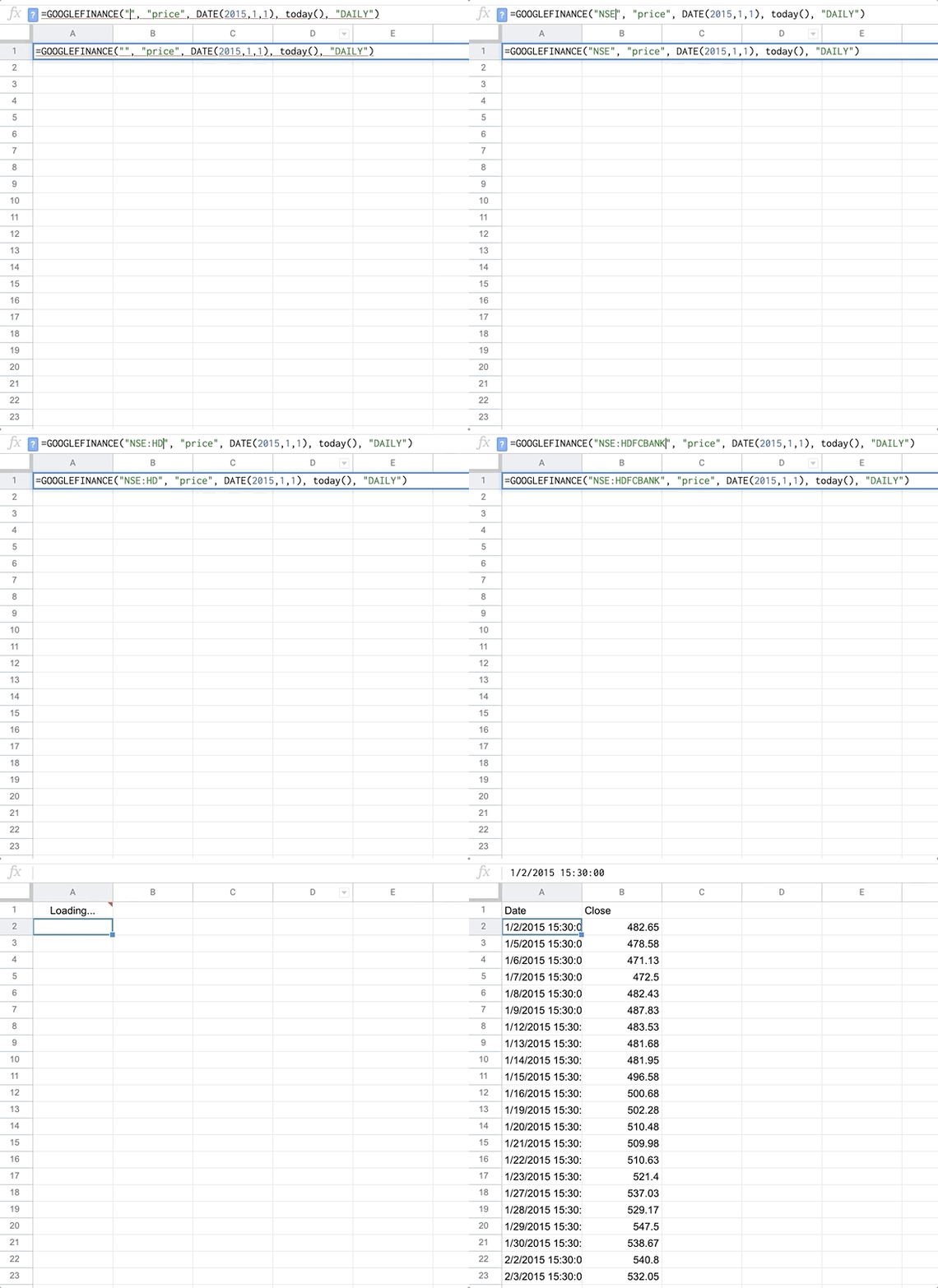
    Go to https://www.google.com/finance/ and start searching for the mutual fund. The search results in the dropdown and page shows the MUTF_IN code. And that’s it!

    I have been searching for a long time on how to get the MUTF_IN code for Indian mutual funds. It has been a hit-and-miss for me trying to search on Google. Finally, I think, I figured out a sure shot way to get the MUTF_IN code.

    Go to Morning Star India. Search for your mutual fund in the search box and go to the search result page.

    Get the name of the mutual fund as it appears in the Morning Star page. For some reason Morning Star does not allow you to copy text from its site so you will have to type it. For those who are aware about Inspect Element I don’t think I need to say anything else.

    Type this name in Google search and you should get MUTF_IN code. You can then use the MUTF_IN code in the GOOGLEFINANCE in Google Sheets.

    Additional points to note

    1. This seems to work only for equity funds. Not debt or arbitrage funds (honestly, I don’t even know what an arbitrage fund is).
    2. If there is an hyphen (-) in the name of mutual fund as per Morning Star India, add space before and after it when searching it on Google.

  • Return key vs Enter key

    Windows won the OS wars and that’s why I don’t know these subtle differences.

    All keyboards have a dedicated Return key — it’s the big key you’re thinking of above the right Shift key. On a Mac, the key code when you press Return is 36, and the glyph for the key is ↵.

    A dedicated Enter key is generally only present on extended keyboards with a numeric keypad — it’s the key in the lower-right corner and is generally the only oversized key on the keyboard that is larger vertically, not horizontally. Its Mac key code is 76 and its glyph is ⌅. Just look at such a keyboard: the Return key says “Return”, and the Enter key says “Enter”.

    Return and Enter Are Two Different Keys
  • Animations in Office UI Fabric

    Working on an assignment and rummaging through Google search results I ran into this page. Apparently, Office UI Fabric supports animation. But the documentation does not list out any details as to what classes to use, neither are there any examples. More search and I find this issue having similar complaint as mine. The issue also lists a sample code using CSS-in-JS to implement animation. Lets take a look.

    First lets import animation modules from Office UI Fabric.

    import { AnimationStyles, AnimationClassNames, AnimationVariables } from 'office-ui-fabric-react/lib/Styling';

    Lets take a look at what each modules does.

    AnimationStyles

    This module contains all the standard Office UI Fabric animations as JSON objects with predefined keyframes. Below are the styles we can use.

    slideRightIn10
    slideRightIn20
    slideRightIn40
    slideRightIn400
    slideLeftIn10
    slideLeftIn20
    slideLeftIn40
    slideLeftIn400
    slideUpIn10
    slideUpIn20
    slideDownIn10
    slideDownIn20
    slideRightOut10
    slideRightOut20
    slideRightOut40
    slideRightOut400
    slideLeftOut10
    slideLeftOut20
    slideLeftOut40
    slideLeftOut400
    slideUpOut10
    slideUpOut20
    slideDownOut10
    slideDownOut20
    scaleUpIn100
    scaleDownIn100
    scaleUpOut103
    scaleDownOut98
    fadeIn100
    fadeIn200
    fadeIn400
    fadeIn500
    fadeOut100
    fadeOut200
    fadeOut400
    fadeOut500
    rotate90deg
    rotateN90deg

    To use AnimationStyles you use the CSS-in-JS approach with the JavaScript spread operator.

    const btnStyleSlideIn: IButtonStyles = {
        root: {
            ...AnimationStyles.slideLeftIn400
        }
    };

    Below is the sample React code implementation.

    public render(): React.ReactElement {
        const btnStyleSlideIn: IButtonStyles = {
            root: {
                ...AnimationStyles.slideLeftIn400
            }
        };
        return (<>
            <PrimaryButton text="Animate"
                onClick={(_) => {
                    this.setState({
                        enableAnimation: true
                    }, () => {
                        setTimeout(() => {
                            this.setState({
                                enableAnimation: false
                            });
                        }, 2000)
                    });
                }}
                disabled={this.state.enableAnimation} />
            <Button text="I am sliding in to left"
                iconProps={{ iconName: 'ChevronLeft' }}
                styles={this.state.enableAnimation ? btnStyleSlideIn : {}} />
        </>);
    }

    AnimationClassNames

    This module contains all the standard Office UI Fabric animation class names. It is similar to AnimationStyles but it just gives you class names rather than the JSON object. Below is the sample React code implementation.

    public render(): React.ReactElement {
        return (<>
            <PrimaryButton text="Animate"
                onClick={(_) => {
                    this.setState({
                        enableAnimation: true
                    }, () => {
                        setTimeout(() => {
                            this.setState({
                                enableAnimation: false
                            });
                        }, 2000)
                    });
                }}
                disabled={this.state.enableAnimation} />
            <Button text="I am sliding in to left, using CSS class"
                iconProps={{ iconName: 'ChevronLeft' }}
                className={this.state.enableAnimation ? AnimationClassNames.slideLeftIn400 : ""} />
        </>);
    }

    AnimationVariables

    This module exports duration values and easing functions which can be used in custom animations. You can use these values in your animations. If you log it to browser console you should see something similar to below output.

    {
        durationValue1: "0.167s",
        durationValue2: "0.267s",
        durationValue3: "0.367s",
        durationValue4: "0.467s",
        easeFunction1: "cubic-bezier(.1,.9,.2,1)",
        easeFunction2: "cubic-bezier(.1,.25,.75,.9)"
    }

    Below is a sample React code implementation.

    public render(): React.ReactElement {
        const kf: string = keyframes({
            "12.5%": { left: -5 },
            "25%": { left: 5 },
            "37.5%": { left: -2.5 },
            "50%": { left: 2.5 },
            "62.5%": { left: -1 },
            "75%": { left: 1 }
        });
        
        const btnStyleShakeIt: IButtonStyles = {
            root: {
                animationDuration: AnimationVariables.durationValue1, // Use Office UI Fabric animation duration
                animationName: kf
            }
        };
    
        return (<>
            <PrimaryButton text="Animate"
                onClick={(_) => {
                    this.setState({
                        enableAnimation: true
                    }, () => {
                        setTimeout(() => {
                            this.setState({
                                enableAnimation: false
                            });
                        }, 2000)
                    });
                }}
                disabled={this.state.enableAnimation} />
            <Button text="Shake it!"
                styles={this.state.enableAnimation ? btnStyleShakeIt : {}} />
        </>);
    }

  • Testing SPFx web part on Modern page – not on workbench

    For a long time I have been developing and testing my SPFx web part on workbench.aspx, which is a terrible option considering you only have limited screen space and you don’t get to see how your web part will look like once it is added to the page. Well, there is a way to test and debug your web part on Modern page.

    First, lets create sppkg package to deploy. For that, run the below commands.

    1. gulp clean
    2. gulp bundle
    3. gulp package-solution

    Note that I am not using the --ship option while running the bundle and package-solution tasks. This will give you a warning – [package-solution] This is not a production build (--ship or --production), therefore the "includeClientSideAssets" setting will be ignored. That’s what we want.

    Second, deploy your generated sppkg package to App Catalog and add web part to your page. When you load the page it will give error.

    This is because our code was not added to sppkg package as we did not use the --ship option.

    Third and final step, run gulp serve command and view the page. You can now test and debug the web part on the page.

  • TextEdit on Mac without formatting

    By default TextEdit shows rich text formatting options and saves file in RTF format. If you are looking for no-frills plain text editor, go to Format > Make Plain Text or press command + shift + T. The menu and key are essentially a toggle which switch between rich text and plain text. To make the plain text permanent go to TextEdit > Preferences… and select Plain text under the Format section.

  • Get count of items/files in list/document library in SharePoint Online with SPFx

    In SharePoint Online, when we view Site Contents, internally a call is made to the end point /_api/web/AppTiles to get the count of items/files in list/document library that the current site collection has. We can call this API in SPFx webpart to get these details. Below is the sample code.

    import { SPHttpClient, SPHttpClientResponse, SPHttpClientConfiguration } from '@microsoft/sp-http';
    
    this.context.spHttpClient.get(`${this.context.pageContext.web.absoluteUrl}/_api/web/AppTiles`, SPHttpClient.configurations.v1)
      .then((response: SPHttpClientResponse) => {
        response.json()
          .then((responseJSON: any) => {
            console.log(responseJSON); // Gets all the list and document library details in JSON
          })
          .catch(error => {
            console.log(error);
          });
      })
      .catch(error => {
        console.log(error);
      });

    this.context refers to WebPartContext in the BaseClientSideWebPart class. The output will looks something like below JSON snippet. There is a lot of detail here which we can filter using $select. The attributes we require are Title and ChildCount.

    {
        "@odata.context": "https://mysite.sharepoint.com/sites/mysitecollection/_api/$metadata#AppTiles",
        "value": [
          {
            "@odata.type": "#SP.AppTile",
            "@odata.id": "https://mysite.sharepoint.com/sites/mysitecollection/_api/SP.AppTile0aab34a5-8bb4-4d5e-bac0-90841a08dd34",
            "@odata.editLink": "SP.AppTile0aab34a5-8bb4-4d5e-bac0-90841a08dd34",
            "AppId": "58de69fc-9e3f-4375-af44-205eeb452366",
            "AppPrincipalId": "",
            "AppSource": 0,
            "AppStatus": 4,
            "AppType": 0,
            "AssetId": "0;00bfea23-e717-4e80-bb17-d0c71b360101;101;",
            "BaseTemplate": 101,
            "ChildCount": 5,
            "ContentMarket": "",
            "CustomSettingsUrl": "",
            "Description": "",
            "IsCorporateCatalogSite": false,
            "LastModified": "4/26/2020 4:16 AM",
            "LastModifiedDate": "2020-04-26T11:16:27Z",
            "ProductId": "00cfea20-e900-4e80-aa17-d0c71b360101",
            "Target": "/sites/mysitecollection/Shared Documents/Forms/AllItems.aspx",
            "Thumbnail": "/_layouts/15/images/ltdl.png?rev=47",
            "Title": "Documents",
            "Version": "4"
          },
          ...
        ]
      }

  • Adding boilerplate code of React component in SPFx using VS Code

    React does not provide command line interface like Angular’s ng generate to create boilerplate code for React components. So you end up copying code from previous components and then modifying it. VS Code has snippets feature that we can leverage to create our own boilerplate code.

    To create your own snippets, go to User Snippets under File > Preferences (Code > Preferences on macOS) and select New Global Snippets file… Enter the name of the snippet file. You get a JSON file with below contents.

    {
    	// Place your global snippets here. Each snippet is defined under a snippet name and has a scope, prefix, body and 
    	// description. Add comma separated ids of the languages where the snippet is applicable in the scope field. If scope 
    	// is left empty or omitted, the snippet gets applied to all languages. The prefix is what is 
    	// used to trigger the snippet and the body will be expanded and inserted. Possible variables are: 
    	// $1, $2 for tab stops, $0 for the final cursor position, and ${1:label}, ${2:another} for placeholders. 
    	// Placeholders with the same ids are connected.
    	// Example:
    	// "Print to console": {
    	// 	"scope": "javascript,typescript",
    	// 	"prefix": "log",
    	// 	"body": [
    	// 		"console.log('$1');",
    	// 		"$2"
    	// 	],
    	// 	"description": "Log output to console"
    	// }
    }

    Update the file with below code.

    {
    	"SPFx React Component Template": {
    		"prefix": "spfxtsx",
    		"body": [
    			"import * as React from 'react';" ,
    			"export default class $1 extends React.Component<I$1Props, {}> {" ,
    			"    constructor(props: I$1Props, public state: any) {" ,
    			"        super(props);" ,
    			"    }" ,
    			"    public componentDidMount() {" ,
    			"    }" ,
    			"    public render(): React.ReactElement<I$1Props> {" ,
    			"        return(<>" ,
    			"        </>);" ,
    			"    }" ,
    			"}" ,
    			"interface I$1Props {}"
    		],
    		"description": "Creates React component boilerplate code for SPFx"
    	}
    }

    The prefix (spfxtsx) here is the trigger text which will give you option to enter the snippet. $1 indicates tabstop and allows user to enter the name of the component, which is also used in name of props interface. In your tsx file when you start entering spfxtsx, it will populate with boilerplate code.

  • Uploading file with progress indicator in SPFx webpart using PnPJS in SharePoint

    SharePoint provides StartUpload, ContinueUpload and FinishUpload REST APIs to upload large files in chunk. PnPJS Library simplifies the implementation and we have to call only one method to upload file in chunks.

    To upload file in chunks in PnPJS, you call addChunked method by supplying a callback function which can be used to track the progress of the upload.

    sp.web.getFolderByServerRelativeUrl("/sites/naveegator/Shared%20Documents/")
        .files
        .addChunked(file.name, file,
            data => {
                // Here we update the progress by fetching data.blockNumber and data.totalBlocks
            }, true)
        }

    The third parameter in addChunked method is the callback function which provides ability to view in how many chunks the file are being uploaded (totalBlocks) and what is the current chunk (blockNumber) that is being uploaded. Using this information we can create progress bar to show percentage of file uploaded. Below is the React component in SPFx webpart. It uses PorgressIndicator from Office UI Fabric aka Fluent UI to display the progress bar.

    import * as React from 'react';
    import { ProgressIndicator } from 'office-ui-fabric-react/lib/ProgressIndicator';
    import { PrimaryButton } from 'office-ui-fabric-react';
    import { sp } from "@pnp/sp/presets/all";
    
    export default class UploadFile extends React.Component<IUploadFileProps, {}> {
      constructor(props: IUploadFileProps, public state: any) {
        super(props);
    
        this.state = {
          showProgress: false,
          progressLabel: "File upload progress",
          progressDescription: "",
          progressPercent: 0
        };
      }
    
      public render(): React.ReactElement<IUploadFileProps> {
        return (
          <>
            <input type="file" id="fileInput" /><br />
            <PrimaryButton text="Upload" onClick={this.uploadFile} /> <br />
            <ProgressIndicator
              label={this.state.progressLabel}
              description={this.state.progressDescription}
              percentComplete={this.state.progressPercent}
              barHeight={5} />
          </>
        );
      }
    
      private uploadFile = () => {
        let input = document.getElementById("fileInput") as HTMLInputElement;
        let file = input.files[0];
        let chunkSize = 40960; // Default chunksize is 10485760. This number was chosen to demonstrate file upload progress
        this.setState({ showProgress: true });
        sp.web.getFolderByServerRelativeUrl("/sites/naveegator/Shared%20Documents/")
          .files
          .addChunked(file.name, file,
            data => {
              let percent = (data.blockNumber / data.totalBlocks);
              this.setState({
                progressPercent: percent,
                progressDescription: `${Math.round(percent * 100)} %`
              });
            }, true,
            chunkSize)
          .then(r => {
            console.log("File uploaded successfully");
            this.setState({
              progressPercent: 1,
              progressDescription: `File upload complete`
            });
          })
          .catch(e => {
            console.log("Error while uploading file");
            console.log(e);
          });
    
      }
    }
    
    interface IUploadFileProps { }
    

    I have used chunkSize as 40960 so that I could display the progress bar for smaller sized file. For actual implementation you can omit that argument.

  • Passing function keys to Windows on Amazon WorkSpaces from MacBook with Touch Bar

    If you have MacBook with Touch Bar and you use it to access Windows on Amazon WorkSpaces then pressing fn + (function key) does not do anything on Windows. To get around this problem you have to update the below settings.

    Go to  > System Preferences… > Keyboard and update the settings Touch bar shows to F1, F2, etc. Keys.

    Downsides to this work around:

    • The function key F11 still goes to Mac and shows Desktop on Mac
    • You lose direct access to App Controls via Touch Bar